Diagrams And Graphs To Visualize What You Have Read
Diagrams, drawings, and visual representations are ideal for illustrating the content of texts and books. They effectively display developments and relationships in a clear and organized manner, helping to summarize information concisely. Creating and viewing these visualizations also enhances the reproducibility of what has been read, as these images are much easier to remember and quicker to review than text or notes.
To use diagrams and visual representations effectively, it’s essential to understand when and how to use different types of diagrams. Here, several visualization options are described, along with their best use cases, as the choice of the right type of diagram always depends on what needs to be illustrated.
Axis Diagrams
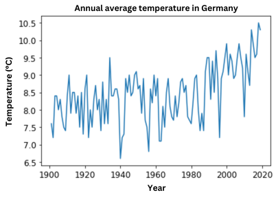
Description: Axis diagrams use a coordinate system where the x-axis and y-axis each represent a measurement variable. Multiple data points are then plotted in the system and connected by a line.
Purpose: Axis diagrams are used to illustrate the relationship between two parameters, showing how changes in one parameter affect the other.
Example: An axis diagram could show the annual average temperature in Germany over time, revealing how the average temperature has changed from 1900 to 2020.
Column and Bar Charts
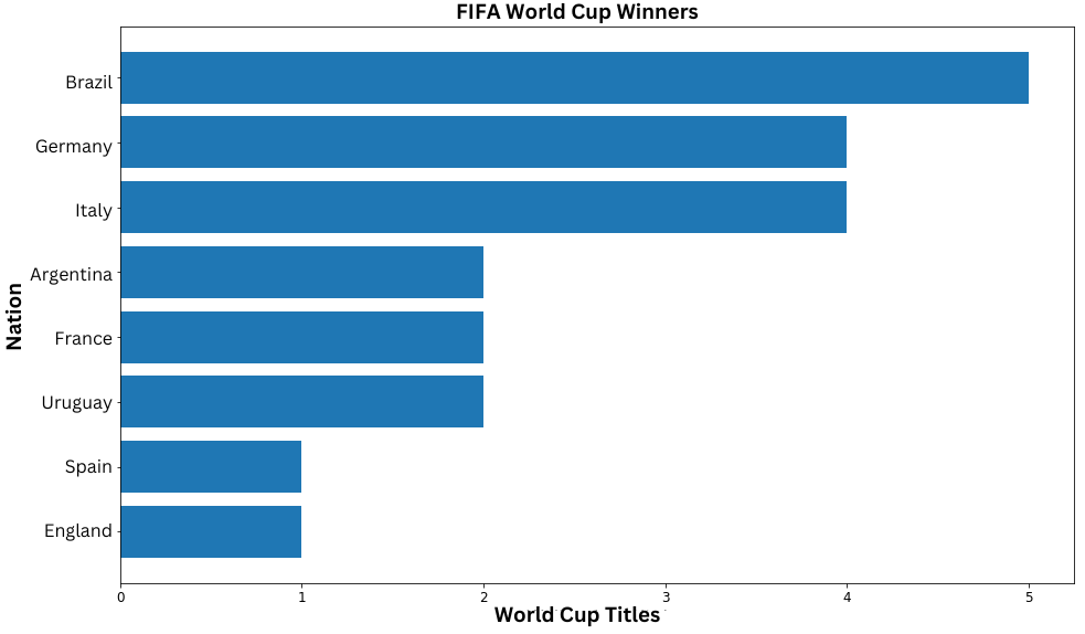
Description: Column and bar charts typically compare a nominally scaled variable with a metrically scaled variable. Categories, items, or time points might serve as the nominally scaled variable, while average values, sums, or specific values can serve as the metrically scaled variable. The nominally scaled variable is represented along the x-axis in a column chart and along the y-axis in a bar chart. Each category has a column or bar whose height or width reflects the corresponding value of the metric variable.
Purpose: Column and bar charts are useful for illustrating rankings and developments. For showing developments over time, a column chart with time on the x-axis is often used.
Example: A bar chart showing the number of World Cup wins per nation makes it easy to see a ranking.
Pie Charts
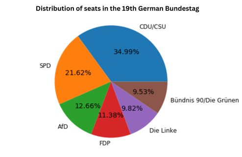
Description: A pie chart consists of a circle divided into segments. The circle represents the total, and each segment represents a portion, with segment size proportional to its share of the total. The segments can also be labeled and colored.
Purpose: Pie charts are effective for displaying the (percentage) distribution of different parameters or the relative size of parts within a whole.
Example: A pie chart could illustrate the seat distribution in the 19th German Bundestag, clearly showing each party’s share of seats.
Graphs
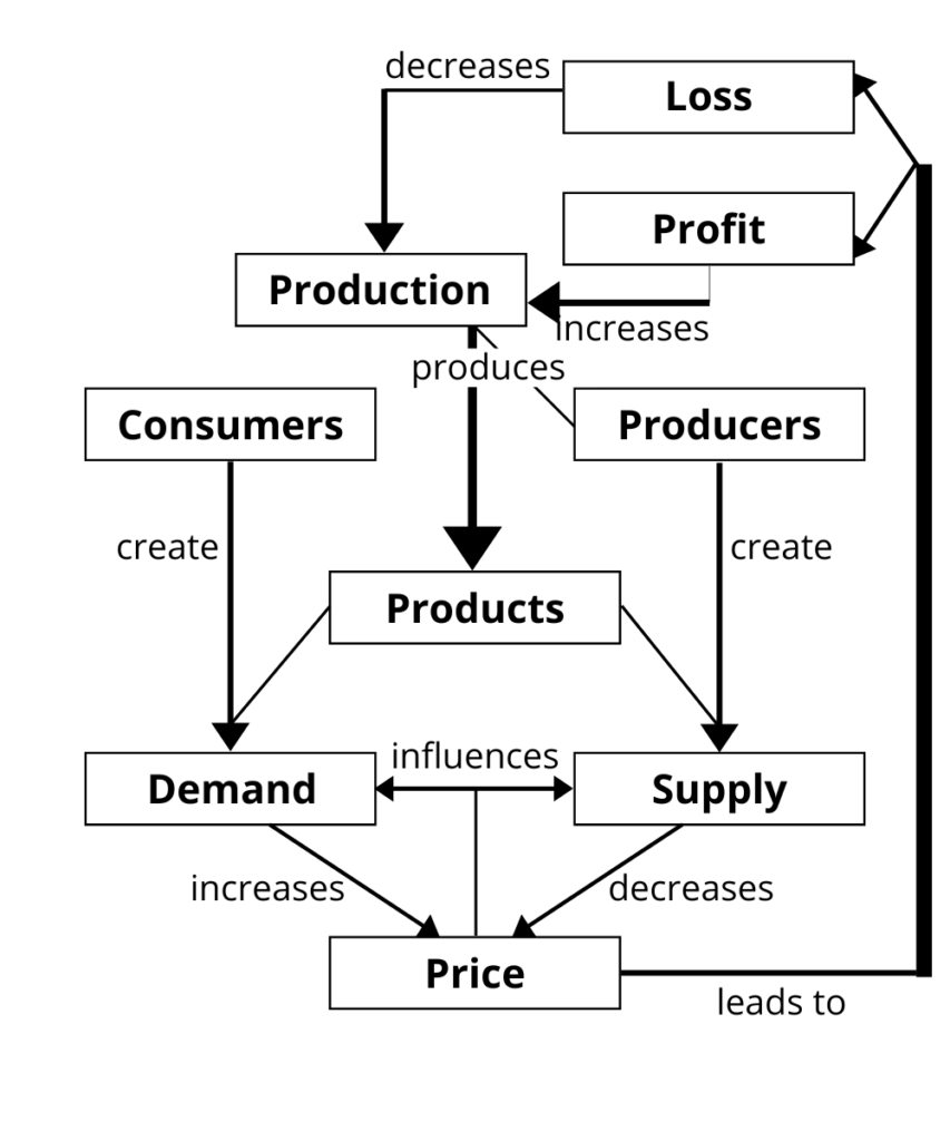
Description: A graph consists of nodes and edges. Nodes represent objects, and edges represent connections or relationships between them. Edges may be directed and labeled to specify the type of relationship and define the reading direction.
Purpose: Graphs are well-suited for illustrating structures and relationships, making them useful for gaining an overview of a subject area or summarizing it later. Graphs can be easily expanded by adding new objects or relationships.
Example: Concept maps and flowcharts are examples of graphs.
Trees
Description: Trees are a specific form of graphs that contain no closed loops. A tree typically consists of a root node, several internal nodes, and leaves, creating a hierarchical arrangement from root to leaves.
Purpose: Trees are useful for visually organizing a topic from general to specific. They can show the breakdown of a main category into subcategories.
Example: Organizational charts and mind maps are examples of trees.

Set Diagrams
Description: Set diagrams, also known as Venn diagrams, depict various sets and their relationships. Each set is represented by circles or other shapes, which may overlap.
Purpose: Set diagrams can illustrate intersections, unions, and subsets.
Example: A set diagram could show how to find your true purpose, representing the intersection of what you enjoy, what you are good at, what you can be paid for, and what the world needs.

Cycle Diagrams
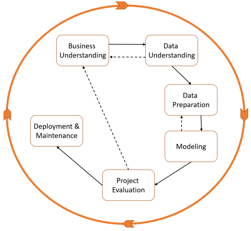
Description: A cycle diagram illustrates a loop, with all components arranged in a circle and connected by arrows.
Purpose: Cycle diagrams are useful for showing cyclic processes, such as virtuous or vicious cycles.
Example: The CRISP-DM process for data analysis could be depicted in a cycle diagram, showing each step from understanding the project to data preparation, modeling, and evaluating results to decide on repeating or completing the cycle.
Flowcharts
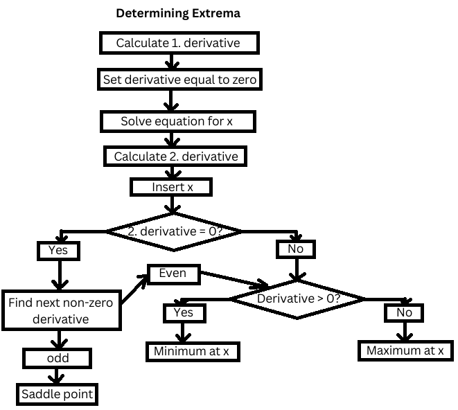
Description: Flowcharts outline a process, where instructions are shown in rectangles and decision points with multiple possible paths are shown as diamonds. Arrows between instructions and decisions clarify the sequence.
Purpose: Flowcharts are ideal for illustrating complex processes, especially those with alternative or parallel pathways.
Example: A flowchart could illustrate the process of finding extremum points in calculus.
Schematic Drawings
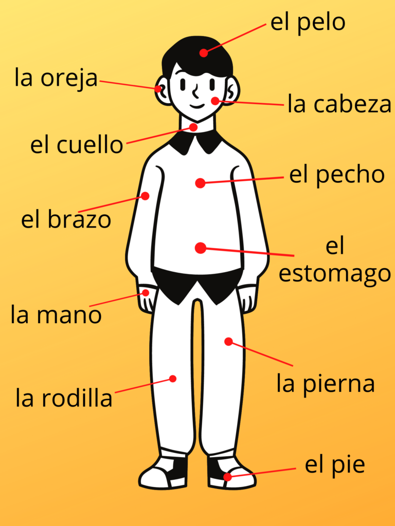
Description: A schematic drawing includes a diagram or photograph of an object that is labeled to explain each part. Arrows or symbols may be added to describe the structure or process.
Purpose: Schematics are excellent for explaining the structure of an object, system, or process. The labeled parts can help define technical terms or foreign language vocabulary, making them particularly useful for language learning.
Example: A schematic could label body parts in Spanish to help with vocabulary.
Using Diagrams and Visual Representations
Once you’ve chosen an appropriate type of diagram to visualize what you’ve read, you can incorporate it into your knowledge base and use spaced repetition to reinforce it in long-term memory. This allows you to revisit and review the content of texts and books whenever needed. Visualizing what you’ve read also makes it easier to remember and retrieve the content over time.
If you create several diagrams for a book, you could also compile them into a memoflip, providing a concise and illustrated summary of the book’s contents. This memoflip can then be quickly reviewed to keep the material fresh.


